
Analyzing Philadelphia's Bike Thefts
While mulling over project ideas and browsing Twitter earlier today I ran across http://opendataphilly.org/. Per their website OpenDataPhilly "is a portal that provides access to over 175 data sets, applications, and APIs related to the Philadelphia region. Simply accessing data, however, is not the ultimate goal of OpenDataPhilly. By connecting people with data, we’re hoping to encourage users to take the data and transform it into creative applications, projects, and visualizations that demonstrate the power that data can have in understanding and shaping our communities." This sounded intriguing enough, so I began sorting through the available data. After browsing for a while I ran across a set of all bicycle thefts reported to the Philadelphia police department from January 1st, 2010 to September 16th, 2013. I thought it would be interesting to see what type of questions this data set could answer, so I downloaded the CSV and opened up iPython.
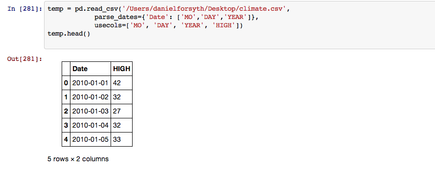
First I imported the appropriate libraries, in this case it was Pandas and Matplotlib. I then loaded the data and took a quick look at it using the .head() method which displays the the first 5 rows by default.
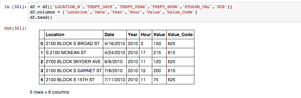
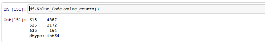
Next I took only the columns I was interested in using for this analysis and renamed them to make life easier during the rest of the process. The Value_Code column breaks the bike value into three categories. 615 is a bike over 200 dollars, 625 is a bike between 50 and 200 dollars and 635 is a bike valued under 50 dollars.
After I had the data imported and cleaned up I wanted to get a better feel for what I was looking at so I created a plot of the thefts over the entire time period.
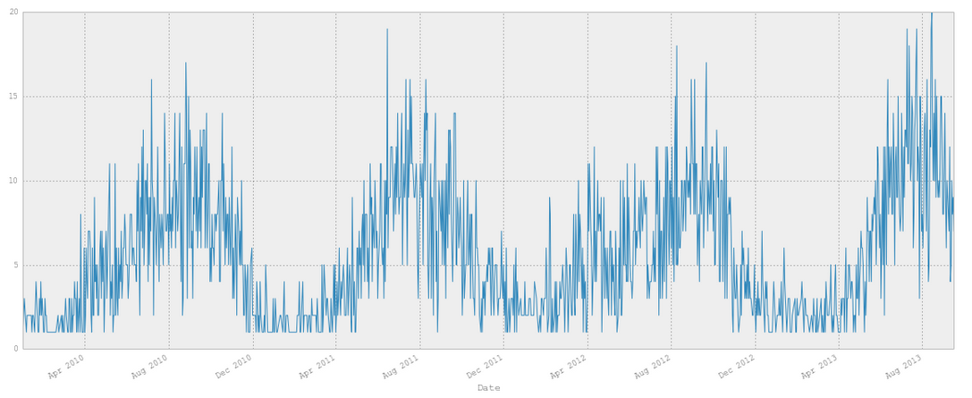
Something that stood out immediately was how many more thefts occured in the warmer months than in the winter. This reminded me of a few articles I had read on this topic, such as this from the WSJ.
After seeing this coorelation I downloaded some weather data for Philadelphia going back to January 1st, 2010(where the theft reporting begins) and loaded it in.
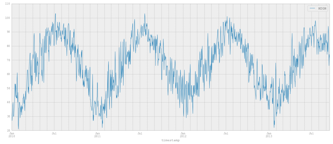
Looks pretty familiary doesnt it?
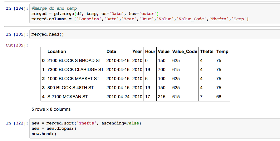
After I had both dataframes loaded I then merged them together.
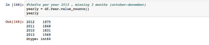
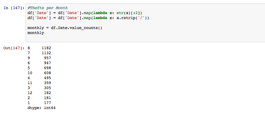
Next I started breaking the dates down to see when the most crimes occured. First by year, note that 2013 is significantly lower because the data set ended in September, leaving out the last three months of the year.
Then I broke it down by month, as you can see the two hottest months are on top with almost ten times the thefts compared to the colder months.
I then seperated the data by hour, looks like most thefts occur at the end of the work day into the evening.

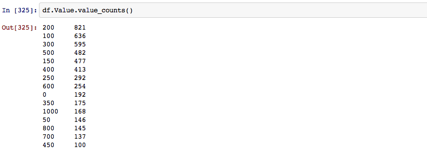
After seperating everything by time I began working with the actual value of the bikes, seems that most bikes taken are in the two to five hundred dollar range.
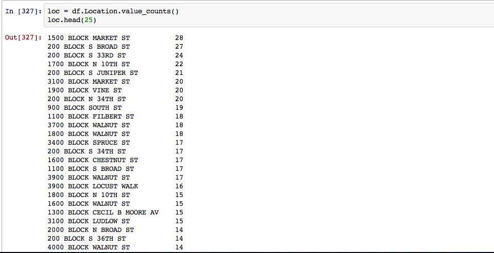
Next up was seeing the most theft prone blocks and creating a simple map of every theft:
This was by no means an exhaustive analysis but rather a quick experiment, It still brought up some intriguing points and strong correlations which would interesting to take a step further and test for causation. In the future I would like to add a machine learning aspect to this to estimate probabilites your bike will be stolen based on time of year, location, cost of bike etc. I would also like to create more advanced visualizations, possibily with D3.
The complete notebook is available here and all of the code is on my github.
Any feedback, advice, or corrections are appreciated. You can find me on Twitter or email me at danforsyth1@gmail.com.