
Mapping NYC Taxi Data
This post was inspired by HN user eck's top comment seen here.
Earlier this week the New York City Taxi & Limousine Commission officially released yellow and green taxi trip record data for all of 2014 and up to June of 2015. This includes millions of records that include pick-up and drop-off dates and times, pick-up and drop-off locations, trip distances, itemized fares, rate types, payment types, and driver-reported passenger counts. The data, which was previously only available through submission of a formal Freedom of Information Law (FOIL) request, is available in CSV format as well as from Google's BigQuery tools [1].
After seeing the aforementioned comment and its accompanying visualization I wanted to have a go at replicating it in python. The first step was getting the data into pandas. In this situation it was much easier to query the data from GBQ than to download the individual CSV files. (Note that you must have the google-api-python-client installed and and be logged into GBQ and create a new project for this to work properly). Pandas has an included pandas.io.gbq module that allows you to parse the results of a GBQ query into a dataframe very easily. The following query creates a dataframe that includes the latitude and longitude of all pickup locations in 2015, this ends up being around 750,000 records.
import pandas as pd

df=pd.io.gbq.read_gbq("""
SELECT ROUND(pickup_latitude, 4) as lat, ROUND(pickup_longitude, 4) as long, COUNT(*) as num_pickups
FROM [nyc-tlc:yellow.trips_2015]
WHERE (pickup_latitude BETWEEN 40.61 AND 40.91) AND (pickup_longitude BETWEEN -74.06 AND -73.77 )
GROUP BY lat, long
""", project_id='taxi-1029')
Once you have the dataframe ready the next step is to plot it. I chose to use matplotlib which always entails fiddling with a bunch of different parameters. I ended up using the following code which simply plots the longitude and latitude on a two dimensional scatter plot.
import matplotlib
import matplotlib.pyplot as plt
#Inline Plotting for Ipython Notebook
%matplotlib inline

pd.options.display.mpl_style = 'default' #Better Styling
new_style = {'grid': False} #Remove grid
matplotlib.rc('axes', **new_style)
from matplotlib import rcParams
rcParams['figure.figsize'] = (17.5, 17) #Size of figure
rcParams['figure.dpi'] = 250

P.set_axis_bgcolor('black') #Background Color

P=df.plot(kind='scatter', x='long', y='lat',color='white',xlim=(-74.06,-73.77),ylim=(40.61, 40.91),s=.02,alpha=.6)
And the Result:
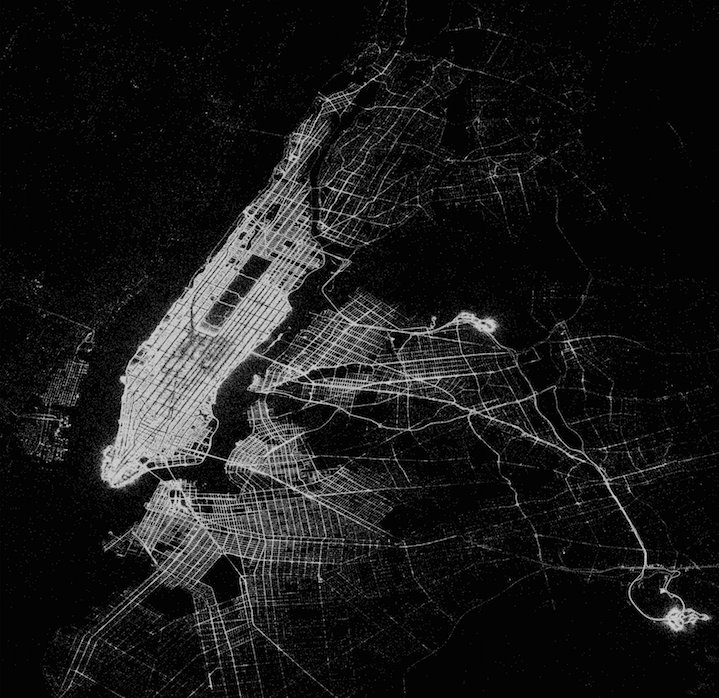
I was quite pleased with the result, it is interesting to toy with the different parameters such as the size of the dataframe, axis scales, size, color, and opacity of the individual points to see how it affects the overall appearance of the plot. It seems to me the only limit of what is possible with this dataset is ones imagination, it is going to be exciting to see what others put together, especially since the press release stated all data back to 2009 when the program started is going to be released in the coming weeks.
If you have any questions, feedback, advice, or corrections please get in touch with me on Twitter or email me at danforsyth1@gmail.com.